UI & UX Design
wd-40 Brand
Project: To take three separate WD-40 brand websites and create one website to feature all three of the WD-40 Brands and showcase the number of solutions that the company has to offer.
Problem: Previously, WD-40 housed each product line, WD-40 Multi-Use, WD-40 Specialist, and WD-40 BIKE on separate websites with no cross-selling opportunities. This presented the client with the issue of managing multiple websites for three of their product brands as well as left the customer unaware of the other product lines and solutions that WD-40 offered.
Process: Utilized the key aspects of behavior design, to create a website that delivered a customized and personalized experience for each visitor based on their interests and product use case.
Resolution: WD-40’s new dynamic website is able to recognize each visitor's behavior. While on the site, the personalization engine tracks their interests and tailors the content accordingly. With each visit and interaction, the behavioral data grows, providing valuable information for other marketing activities and operational decisions.
Website traffic: Up 17% since the launch of the new site
Visits from returning visitors are up 42% while new visits are up 13%.
Traffic over the past year was dominated by mobile visits (71%). Traffic from mobile grew 48% YoY.
WD-40 recently went through a rebrand and an update to a new look of the site is currently being worked on.
San Francisco Federal Credit Union
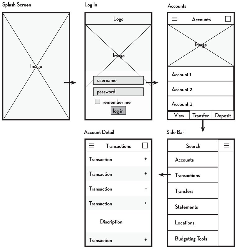
Project: Create a responsive website, online banking, and mobile banking application.
Problem: The majority of credit union members did not use online banking. The average membership age was 58 (data from 2015) and unsure about changing their banking habits from an in-person banking experience to an online experience. In addition to creating a website with a better user experience, there was a great deal of education for members on the benefits that online banking could provide.
Process: Met with internal stakeholders, conducted research, and created wireframes and mockups using Balsamiq, Photoshop, and InDesign. Work directly with 3rd party developers to answer questions and create any needed material. Utilized the new brand standards when creating the UI elements of the website.
Resolution: The new website and the mobile application had an increase of 13,000 users in the first 6 months with the new responsive design. Alongside the launch of the new website, we had training across all of the six branches for anyone that wanted one-on-one assistance, however, the feedback was that it was very straightforward and easy to use. Membership did increase after the launch of the new website, online banking, and creation of the mobile application.
AmeriFirst Financial, Inc.
Project: Update AmeriFirst Financial, Inc.’s corporate website to be more responsive and increase loan applications.
Problem: Visitation to the website was extremely low because the previous website was not designed with any SEO in mind. The bounce rate was 87%, most likely due to not having relevant information and an overall bad user experience. In addition, there was no clear call to action or user path, causing a low conversion rate.
Process: Met with the executive management team to establish goals. Created hand-drawn and digital wireframes, digital mockups, user profiles, and working prototypes using Adobe UX and Photoshop to obtain buy-in from management. Created UX guidelines and requirements document to pass along to 3rd party development team. Worked as the UI & UX designer, project manager, and main point of contact between the development team and AmeriFirst Financial.
Resolution: By simply adding a form section to the bottom of the home page of Amerifirstloan.com, they saw an increase in customer communication of 32% on the corporate website. Individual Loan Offers also saw significant increases in clicks to their personal pages and an increase in applications. Feedback on the creation of the Mortgage Calculator was incredibly positive. Data showed that users stayed on the page longer and interacted with this feature, most likely leading to a call with a loan officer. SEO improved dramatically and the bounce rate is 26% lower than it was prior.
Related UI/UX Projects: www.protectyourtransaction.com and www.colorado.amerifirstloan.com
University of Phoenix
Project: To create a better shopping cart experience for students when they add a course to their cart and buy books for a class. Create a payment plan workflow for enrolled students.
Problem: Shopping Cart: The check-out experience was a 16 step process before students could check out and pay. Many users fall off during the process and ended up having to call in for assistance because it took too long and they were unsure of what step they were on in the process. Payment Plan: There was no system set up for “pay-as-you-go payment plans” for students to pay for their education which researched showed was a major pain point.
Process: Worked closely with an in-house user-research team, created wireframes and working prototypes using Axure for A/B testing, and worked in agile sprints. During this project, we utilized an onsite high-tech, user research center to bring in paid users to test out designs.
Resolution: Shopping Cart: Reduced steps needed in order to check out of shopping cart to just 8 simple steps by reorganizing the hierarchy of information. Made sure that users were only asked a minimal amount of questions to ensure a quicker experience. Testers compared the ease of the check-out experience to that of Target and Amazon. Payment Plan: Designed payment plan system to incorporate pay by card, check, and checking account with autopay and date selection feature. The feedback in testing was positive.


